-
Balatro
Solange bis Slay the Spire 2 für iOS erscheint, muss man seine Zeit am iPad mit etwas anderem verbringen. Na klar, das originale Slay the Spire ist immer noch top, aber für wenn man mal was anderes möchte, habe ich Balatro wirklich zu schätzen gelernt.
Ursprünglich habe ich natürlich mitbekommen, als es erschien und viele Streamer sich damit auseinandergesetzt haben, aber so wirklich geklickt hat es erst, als ich gesehen habe, dass Roffle, den ich für Hearthstone (Wild) abonniert hatte, fulltime dazu gewechselt hat. Seitdem habe ich viel seinen Stream geschaut, aber auch selbst gespielt natürlich.
Ich mag besonders das simple, nicht pay-to-win Preismodell, die liebevolle Gestaltung und dass man jederzeit unterbrechen kann, auch um mal nur 1-2 Hände schnell zu spielen.
Und für die Vollständigkeit: Balatro ist ein Kartenspiel, bei dem man aus einem Pokerdeck versucht, Hands zu ziehen wie Paare, Flush oder Full House und man bekommt Punkte dafür. Der Twist ist, man kann nach jeder Runde in einem Shop seine Karten verbessern oder Joker kaufen, die die Berechnung der Punktzahlen verändern. Klingt lame, aber macht mega Spaß.

-
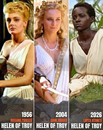
Helena von Troja
Also ich muss das irgendwie total verpasst haben, aber anscheinend regen sich Leute schon wieder auf über die Besetzung von Helena in der upcoming Verfilmung der Odyssee?
Haben irgendwie alle den Schuss nicht gehört oder was? Dann voted halt mit eurem Geldbeutel und schauts euch nicht an? Wie peinlich kann man sich aufführen, wenn man meint, man hätte irgendeine Deutungshoheit auf ein literarisches Werk, das man am Ende nichtmal gelesen hat, sondern 2017 in einer “zu verschenken” Kiste auf DVD gefunden hat?
No offense, aber ich fand Diane Kruger damals auch schon mega stier. Bin grade froh, wenn sie mal was anderes ausprobieren. Und nur weil die AfDler keinen drauf hoch kriegen können, heisst ja nicht, dass niemand das kann. Super ignorante Leute unterwegs mal wieder. Facepalm to the stars.
-
Rescuing data from my IBM ThinkPad 755CE
Some time ago, my dad brought me some of my old stuff that’s been bothering him back at our family home. It seems storing some of my things in this big place really is to much, so now I get something brought back every other visit.
Anyway, one time I got this old laptop briefcase and it had the Thinkpad Laptop that I had been using as my main machine around the turn of the century. It’s an IBM ThinkPad 755 CE that I bought used from my uncle Michael, who got it as his work machine during his time at IBM, so it had a lot of stuff like a docking station, mouse, PCMCIA Ethernet and modem cards (which I remember purchasing myself).
When I got it back a few weeks ago, I figured I’d boot it up and look around for whatever I had left on there. I’m very much a data hoarder, so the thought of doing some file archaeology on myself turned me on somewhat.
The Laptop did boot up, but couldn’t get to the Windows 95 desktop for whatever reason. I gave up.
In the back of my mind, the thought of unsalvaged personal data kept gnawing though. I figured I’d attach the hard drive to my Mac and copy the files I found by hand. Got out the drive, which was amazing because the machine is so modular and servicable it’s unconceivable in the modern day. The 2.5″ IDE drive was in a plastic caddy, with protective stickers and everything. Carefully took it apart and detached the proprietary IDE-to-whatever adapter it had on it. Ordered the cheapest USB 2.0 adapter I found on Amazon.
Today I put everything together and made images of the two partitions (lol) on the 1.4GB drive with Disk Utility. Took about 10 minutes total. Drive didn’t die, all data copied, great success!
I did a tiny bit of spelunking, too, and found some real gems in there. The oelna.de website from about 1999. A single MP3 file. My entire AOL Instant Messenger chat history! School papers in .doc format. Files in my proprietary .tx2 format (which is a renamed .txt file). I’ll see if I can declassify more embarrassing findings in the future, but I’ll leave it at that for today. I’m thinking of a FBI-Epstein-file release cycle, a few at a time, slowly peeling back the curtains and revealing ever more horrendous teenage angst. Stay safe out there!
Fediverse reactions
-
At the movies
Gerade musste ich eine Umfrage für die
FHHSTechnische Hochschule Mannheim ausfüllen, in der nach meiner Beziehung zum Medium Film gefragt wurde. Ich musste kurz etwas reflektieren, aber ich habe mich ziemlich schnell an meine Studienzeit erinnert.Mit dieser Zeit verbinde ich viele liebevolle Erinnerungen in Bezug auf Film. In dieser Zeit kam nämlich irgendein Genie beim CineMaxx Mannheim auf die Idee, man könnte doch die schlecht besuchten Spätvorstellungen ein bisschen boosten, indem man Studierenden ab 22 Uhr einen günstigeren Eintrittspreis anbietet; wenn ich mich recht erinnere, 3 Euro nur?!
Das war eine Zeit, in der gegenüber vom Kino noch die Koeripike (Currywurst und Pommes Experience) existierte und das Wittkoop (einer der ersten richtigen Burgerläden der Stadt. Nicht vergleichbar mit heute, aber damals eine Nummer!)
Jedenfalls war das damals eine Gegend, wo man sich auch abends einen Moment aufhalten konnte in Verbindung mit einem Kinobesuch.
Man kann sich vorstellen, dass junge Leute, die nachmittags und abends zusammen in einer WG in Neckarau abhängen, sich auch gerne mal einen Film reinziehen. Und dass vor 21:30 von denen sowieso niemand richtig einen Plan für den Abend gemacht hat. Wenn jetzt noch jemand sagt, passt auf, wie wär es, wenn statt 12 Euro für den Eintritt ihr nur 3 Euro zahlen müsstet … man würde wo vorher die Leute waren nur noch eine abgeranzte Eckcouch sehen mit ein paar schwitzigen Po-Abdrücken.
Jedenfalls war ich zu dieser Zeit im Durchschnitt drei Mal pro Woche im Kino. In wechselnder Konstellation, mal die ganze Gang, mal nur Max. Was wir für einen Scheiss angeschaut haben, einfach, weil es die günstigste Art war, einen Abend zu verbringen! Es war echt die beste Zeit. Ein Abend Iron Man, der nächste dann White Chicks 2. Es gab keinerlei Qualitätsansprüche. Man hatte irgendwann alle Filme gesehen, die aktuell überhaupt liefen. In quasi leeren Sälen!
Heute existiert an der Stelle nur noch eine Ruine des einstigen Palasts, in der man knapp 20 Euro dafür hinlegt, dass einen der Hintermann mit Corona in den Nacken hustet. Und draussen hat das Soban schon um 22 Uhr dicht gemacht. Es ist einfach nicht mehr das Gleiche. Aber ich denke gerne an die Zeit zurück, in der ich völlig on top des Mainstreams war.
Fediverse reactions
-
Getting back into StarCraft
I have been playing and watching StarCraft since it first came out. When its successor StarCraft 2 came out, I also increasingly watched matches and big tournaments. It was a great time. JustinTV became Twitch, the Day9 dailies were … daily and there were a number of iconic players, as well as casters.
Over the years I’ve had favorites, mostly Protoss players such as MC, HuK, sOs and Classic, but also many others.
In the last decade, the spark has somewhat fizzled and I quit playing myself and only sometimes watched tournament finals, mostly cast by Tastosis, which was the defining casting duo. When they quit GSL, I also did.
Until recently, when in my boredom Youtube suggested I watch Harstem’s channel. I only knew him as a pro player from the Netherlands who sometimes came up in tournaments. I did not know much about him. I seem to have missed out!
His Youtube channel posts daily. Mostly a curated few games of high-level SC2 play, narrated by himself, and boy is he hilarious! I am totally hooked and usually start my evenings by watching him play delicious cheeses against grandmaster opponents.
If you have nostalgic feelings for StarCraft 2, be sure to pay his channel a visit. I’m sure you’ll enjoy it as much as I do. Hashtag not sponsored ofc
Leave a Reply
… reposted this!