-
Bundesrepublike Deutschlike
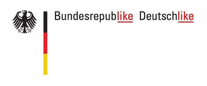
Ich muss sagen, ich fand das neue Logo von Tschechien, das vorige Woche auf viel Widerstand stiess, nicht so übel wie viele andere. Sicher, es ist ein bisschen arg trendy und Facebook-y, aber ich respektiere immer, wenn jemand bereit ist, seine Marke nicht so arg ernst zu nehmen und auch flexibel zu sein, wenn jemand was albernes damit anstellt. Eigentlich fand ich, könnte Deutschland auch mal etwas weniger bieder werden und dafür liebenswerter. Likable eben. Enter Bundesrepublike Deutschlike!
-
Lego
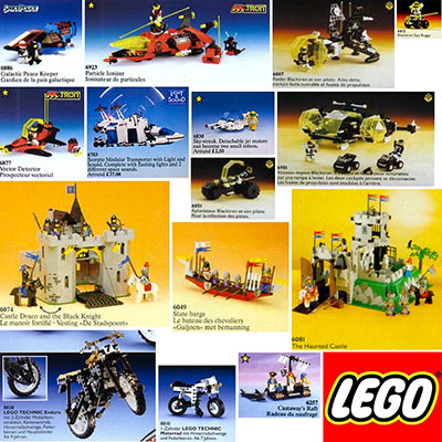
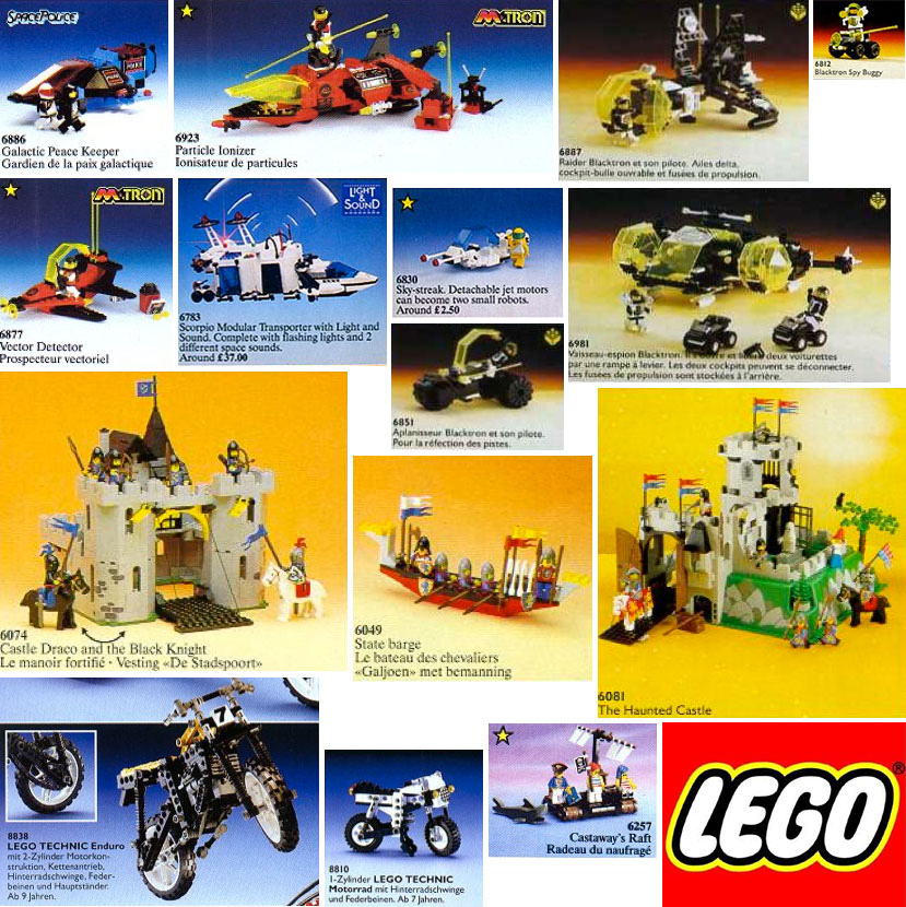
Ich weiss nicht, was ich als Kind mehr geliebt hab: die Ritter, oder die Astronauten. Ach doch, jetzt weiss ichs: meine Eltern.
Comments
-
Das sind übrigens alles Teile, die ich wirklich hatte. Sorgsam aus den Katalogen von 1989-1992 rausgesucht.
-
Ohh, ich will mitspielen:
http://www.flickr.com/photos/nolnet/3476086068/
http://www.flickr.com/photos/nolnet/3475900241Hattest Du noch mehr? Du hattest doch noch mehr!
Hier, meld Dich bei http://www.brickset.com/ an und mach Dir eine Liste mit allen Sets, die Du jemals besessen hast :-)
Leave a Reply
-
-
Reimagining Sunstroke, the iOS Fever Client
Update: Gone East have replied and corrected me on some assumptions. I have updated the post to reflect this.
I am an avid user of RSS feeds. I have a list of about 80 feeds which I check several times a day. I can say that I at least see every news item that pops up. I actually read only a few of them that are interesting to me. But not one goes unseen. They are important to me as a news source.
From the day of its release, I have been using Shaun Inman‘s Fever RSS reader to keep up. IEven though I never use its most advertised feature, a “Hot List” where items are rated and sorted by importance, I enjoyed the idea of a self-hosted solution. The web based approach makes it easy to read from work or at home and keep feeds in sync. It has a decent iPhone optimiezed view, but no native app by the developer (which is really sad, given that Objective-C seems to simply come to him).
Enter Sunstroke, a native iPhone client, that syncs with Fever through its API. I immediately bought it when it came out. I have grown dissatisfied with the Fever webview over the last years; it requires a connection, occasionally feels slow and the animations often stutter for me, which is something that IMO doesn’t fit the iPhone experience. Sadly, Sunstroke wasn’t a good fit for me, either. The syncing is fine (though it feels slower than newly released Reeder 3.0’s), but I don’t agree with much of the design. The graphics are mostly fine, but Sunstroke has made interface decisons I can’t live with for my Fever client.
The most unnerving thing, which makes the app basically useless for me as it is now, is the fact, that when I tap an item on the start screen, say “Kindling”, which I use the most, but other lists work the same, I’d expect to get an overview of feeds in there, not a list of all articles that are in there! If I’d like to read the articles of a specific feed, I’m out of luck. How did this happen? The Fever web client has an obvious three-tier interface: left – overview, center – feed list, right – feed content. This I can understand. This I have become used to. Why would it not be in the app? iOS makes these kinds of tiered lists incredibly intuitive to navigate. Check the mail app. Or the Contacts or Phone app. There are so many more!
One other thing that bugs me if the serif font for the article headlines. Why? The start screen has it right: default Helvetica. Not pretty, but managable. Over all, the fonts could have been chosen a bit better. And if it has to be a serif as default, why not at least make a switch or selection option in the Settings app? A few system fonts would already make me happy.
The last thing I want to talk about are the icons. I find them not particularly intuitive. Why not use the icons that iOS has already on board? The refresh arrow from the mail app. A simple checkmark for “Mark as read”. And what is up with the loading indicator? It doesn’t even move. It is indistinguishable from a button. It really needs to spin. Or do something to indicate it’s doing something right now. The obvious choice would be to have the “Refresh” arrow rotate when it’s loading. Do away with the seperate indicator altogether, is what I’m saying.
Long story short: I put in a few hours of work to piece together a few screens of what my ideal Sunstroke would look like. Obviously I don’t have every screen there is, only the ones I actually use and didn’t like the way they were. If I could write apps, I’d build my own client. But as it stands, it doesn’t look like that will be the case for a while, so I’m giving away my thoughts for free. If the people at Gone East LLC like any of them, they are free to use or implement them. In fact, I hope they will, so I can ditch Reeder, which is a great RSS client, but the design doesn’t sing with me. Too flat and custom for my taste. But enough of that.
I’ll quickly go through the screens and note the changes to Sunstroke as it is today. My screenshots are actually iPhone resolution and look of scaled down, especially fonts. Click for the full view.
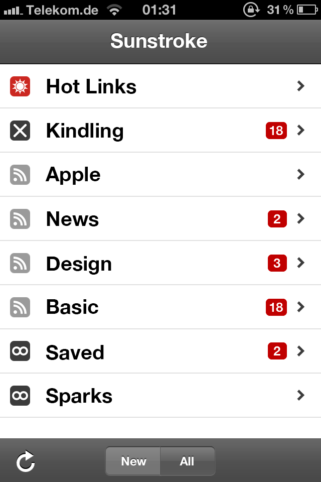
The start screen is actually decent. I didn’t care for the noise in the navigation or bottom bars, so I got rid of it. I did not get why the arrows sometimes have circles and sometimes not, so I took a page out of mail apps book and made them flat. iOS actually has round number indicators, but the ones in Sunstroke look off, maybe due to the font, I don’t know. As an experiment, I took the indicators mail uses. Relief.
Sunstroke has a toggle to only display new feeds, but it’s a simple dot, which I did not expect. Again, iOS already has a mechanic for that, so I used it. It actually says what it does now.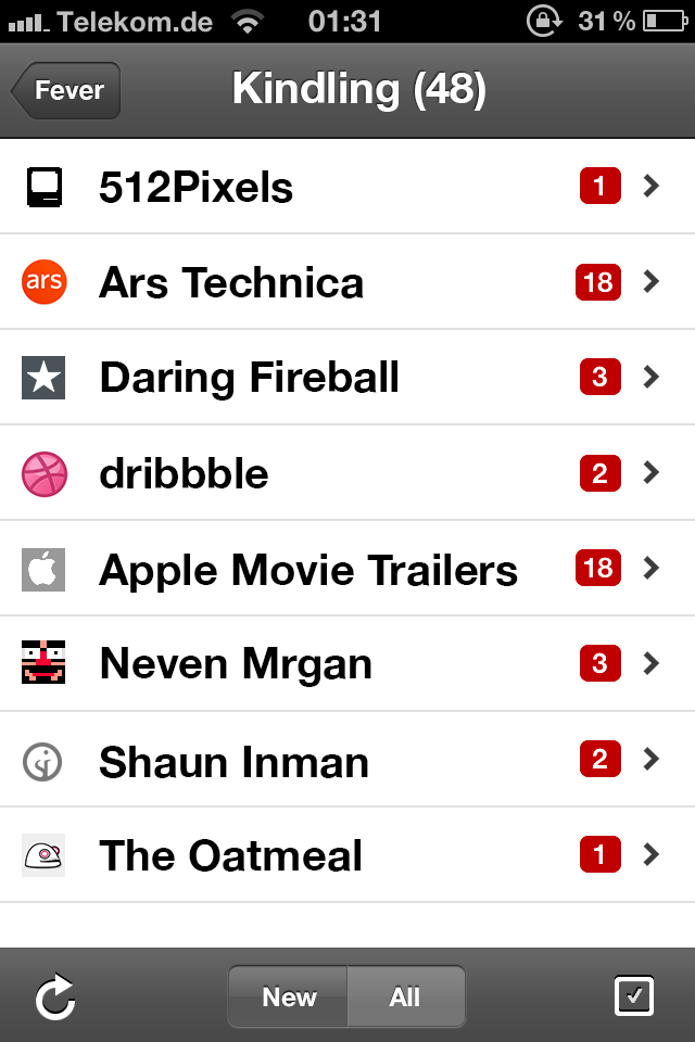
The screen I miss the most, because it is not in Sunstroke, is the feed overview (could be “Kindling”, could be any list). Fever has it, and it was easily imagined what it would look like.
Update: As it turns out, this screen IS in Sunstroke! Thank god. You tap the small circle arrow instead of the category title, as you do in, say, the phone app favorites view. The behavior should be reversed though, IMO.
It has a refresh button and a “Mark as read” button. Simple enough.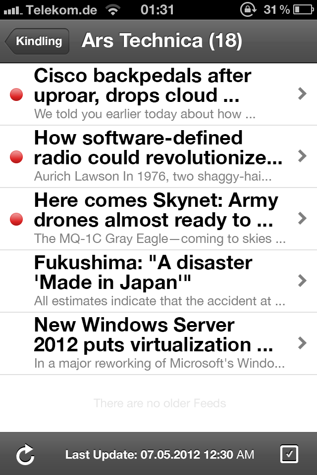
The feed detail view I was most unsure about. It is decent in Sunstroke, but I figured it would have to be more like (again) mail app, so I mocked it up. The unread indicators could be flat to match the rest of the look, but the important thing is the sans-serif font. I somewhat liked the default iOS list headers, which indicate the date in Sunstroke, I simply forgot to put them in my picture. They should remain.
As for the excerpt: the best thing would be if users could choose how many lines should be displayed in the teaser. Some people like more, I myself always pick 0 (in Mail). Anything is fine.
And again: the bottom bar icons are updated.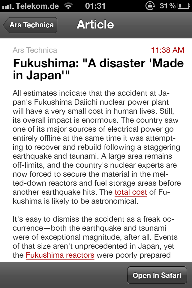
Finally, the article view. It’s good in Sunstroke, but could be cleaned up. Less borders and backgrounds should make for a more enjoyable reading experience.
I didn’t put in the “Previous” and “Next” buttons. They can stay where they are, or could be moved to the top, a la Mail, as there is room, too.
The font in my screenshot looks especially ugly scaled down, so check it out in full view. It could be better, but I think it’s good like this. The lines are not too short and the line height is okay. More I don’t need.That’s pretty much it. That would be my dream Fever app. Shaun could make it more pretty, but that’s the way I expect the interface to work. You can do most of that with default iOS elements, which always feels nice and streamlined. I put together two more screens with a feature I am most excited about in iOS 6: native pull to refresh. I don’t know whether this will be publically available, but boy, do I hope so! Sunstroke could get rid of the refresh button. Check it out (I could live with a color other than blue):

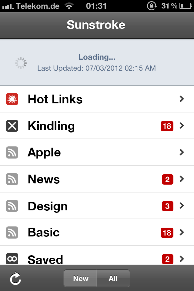
Shaun, if you are reading this, my offer stands: I’ll pay $7.99 for an official iOS Fever app. Which I think you could put together in a day or two by now, judging by your games.
Comments
-
At this time I am going away to do my breakfast, when having my breakfast
coming over again to read other news.
Leave a Reply
-
-
Robotic Asses
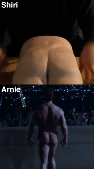
I always knew it was going to be like this. They’re building him from the ass up. When I recently saw the video on youtube, it didn’t immediately click, but today I saw it. We are doomed.
[flattr user=”oelna” title=”Blog: Robotic Asses” url=”http://oelna.de/blog/?p=826″]
Comments
Leave a Reply
-
Scripting an InDesign progress bar for presentations
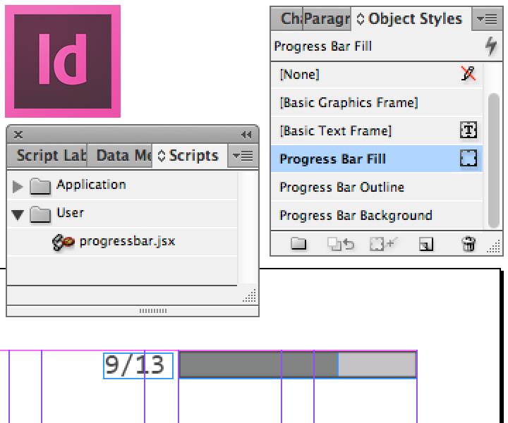
This post has some prose, so I’ll provide you with an easy out, if you have only come for the free stuff: jump to the making of, or download directly.
If you need help with the script installation, Indesignsecrets has you covered. I put mine in the folder ~/Library/Preferences/Adobe InDesign/Version 8.0/en_US/Scripts/Scripts Panel
If you like it, consider a tiny donation. However much it helped you. I appreciate it.
[flattr user=”oelna” title=”Blog: InDesign Progress Bar with Scripting” url=”http://oelna.de/blog/?p=779″]As a designer, you tend to do a lot of presentations. Some more than others, but still: you better know your stuff. In a recent push to bring ultrabold’s (mostly) PDF presentations into the new decade, I suggested they finally switch to a widescreen default, as most of the clients have moved to screens that match the wider resolutions. Also, many of the PDFs are actually shown in-house on a widescreen TV. I’m hoping this will catch on.
But I also wanted to add a little flair to the actual slides, or pages if you will. As the recipient, I also enjoyed when there was a visual indicator of how far along a presentation was. Most of the time, this is a page number. If you are lucky, the total page number is displayed next to it, so you can actually make use of the information. But as a presenter, you don’t want your audience occupied with math all the time, so I figured some sort of progress bar, which is commonplace in the software industry, could provide the information on a more subtle level.
Many designers make their PDF presentations in Adobe InDesign, which is a great fit (I believe it is the best program Adobe has in their lineup). It is not intuitive how you would make something like a progress bar happen in InDesign, though. As the interface did not get me to where I wanted to be, I turned to
GoogleDuckDuckGo, and the consensus was: use scripting. I happen to know some JavaScript, so this looked like a welcome out back to my code editor. I figured the script needed to read the total amount of pages, iterate over all pages and place a rectangle of the appropriate proportion. Easier said than done. I know nothing about InDesign’s object names and methods, so I read a lot of stuff and slowly pieced together a solution.The current version of my œuvre pops up a dialog in which the designer can specify width and height of the progress bar, as well as top and right margins. I figured most bars would be placed on the right, but it should be easy enough to calculate an offset for the left side. In addition, it is possible to specify a range of pages, as it may be useful to omit the first and/or last page of the presentation. They are usually a welcome and thanks for listening note and don’t carry actual content.
The script then creates up to three elements, depending on your preference – an optional background fill color, the bar itself and an optional border. At the same time, three object styles are created, so you can adjust the appearance of the bar with your own stroke and background colors. The code to create new object styles is easy, once you have figured it out. It avoids creating duplicates by trying to get the name property of the style first as a check.
var fill_style;
try {
	fill_style = app.activeDocument.objectStyles.itemByName('Progress Bar Fill');
	var check2 = fill_style.name;
}
catch(error_message) {
	fill_style = app.activeDocument.objectStyles.add({
		name: 'Progress Bar Fill',
		strokeAlignment: StrokeAlignment.INSIDE_ALIGNMENT,
		strokeWeight: 0,
		strokeColor: 'None',
		fillColor: 'Black'
	});
}
You can then apply the style to your page objects like this:
objPref.appliedObjectStyles = fill_style;or pass it directly to the add() method:
appliedObjectStyle: app.activeDocument.objectStyles.itemByName('Progress Bar Outline')The calculation of the actual progress bar width is rather easy (code is shortened):
for(var i=0; i<pages_total ; i++) {
	width = Math.round((progress_width/(pages_total-1))*i*100)/100;
}
The creation of the rectangle is pretty straightforward as well (code is shortened). The bounds variable is an array of coordinates: top, left, bottom, right.
var rectangle = app.activeDocument.pages[0].rectangles.add({
	geometricBounds: bounds,
	appliedObjectStyle: app.activeDocument.objectStyles.itemByName('Progress Bar Background')
});
I hope you get some use out of this. As this was my first dive into InDesign scripting, I’m sure it’s not perfect (as a matter of fact there is a debug flag in the script which enables various debugging messages). And I have benefitted of work others have done, mainly Jongware’s amazing HTML InDesign Help and countless people on StackOverflow who have had similar problems before me.
The dialog window was pieced together from various sample scripts that were present in InDesign.Javascript is quickly becoming my favorite language. Who’d have thought only ten years ago? I’m excited. Next stop: Photoshop.
Comments
-
Hey! This is great, very useful for presentations!
I had this problem cause my presentations were all fullscreen and people was geting confused about the navigation and the content.
Your script is very easy to use yet very powerful. Loved the dialog box, very simple and useful.
Keep up the good work!
Im Jon from Brazil
-
Jon, thanks for the kind words. It’s great to see somebody is getting use out of it. Thanks for taking the time to comment.
-
I noticed that its better to execute the script over a new layer, in case you have to add or remove pages, and then execute the script again, its easy to undo if its all in a layer above.
Maybe you can include that to the script in the future, to create a new layer on top and then populate the pages with the bar!
-
A great idea. I will definitely look into it. However, I usually create the layer myself, as I don’t like too many things happening automatically. This way, I can decide for myself whether I need it on a new layer or not.
I may make it a checkbox option in the popup window. This way, everybody wins. Thanks for your suggestion! -
hi, this is amazing! Is there a way to get this to go vertical rather than horizontal?
Leave a Reply
-
Comments
oder wie wärs mit bundesrepubLIEB?
Fänd ich genau so geil, aber die Schrift müsste dann rosa sein statt rot. Finde ich.
n1!
Bundesrepublike Deutschlan1!
I really enjoy this theme youve got going on on your site. What is the name of the desgin by the way? I was thinking of using this style for the website I am going to construct for my class room project.