Microsoft’s new logo, sliced and diced
I admit it: I’m stuck in a world where Microsoft is Apple’s biggest threat. Where Apple is the underdog and gets its genuinly original ideas and designs ripped off by the software giant. I’m stuck in 2005. That said, I also love design and I love complaining, and with the release of their new logo, Microsoft gave me an excellent reason to blog about them.
Exhibit A:![]()
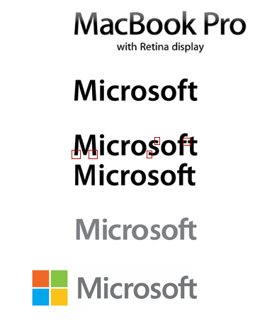
Am I the only one who noticed Apple already built this logo for their release of Boot Camp in 2006?
Exhibit B:
Because it is fun, I’m linking to Andrew Brett Watson’s Myriad–Segoe standoff. For your consideration, I’ve summarized his graphic here. The gist: adjust the M, s and f of Myriad, and you get the Microsoft logo.
If you came here for some serious journalism, you’re obviously very lost. Read the Brand New discussion of the logo instead.