Amazon Bookerly vs Google Literata: Fight!
Recently, both Amazon (with Bookerly) and Google (with Literata) announced/released a family of fonts tailored to the specific needs and capabilities of ebook and tablet screens. The fonts are meant to make reading long-form texts, Ebooks for example, less straining for the eyes. They also look particularly nice on today’s medium- to high-res screens.
I am looking forward to giving them both a try. My first impression was, they both look great and like a good improvement on the exisiting fonts that have been used until now. It is a shame that many devices, such as the Amazon Kindle don’t offer (more simple) means to supplement the preinstalled fonts by installing additional ones.
As kind of a type nerd I like to compare the little differences and details in typefaces, so I put these two side by side. Now you can check them out as well. I even made a longer paragraph so I could get an impression of how the type will look when used for actual books. Click on the images for the original resolution, or download the source PDF.
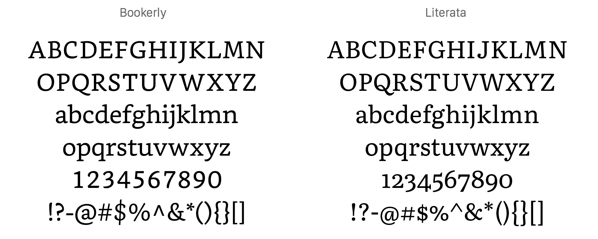
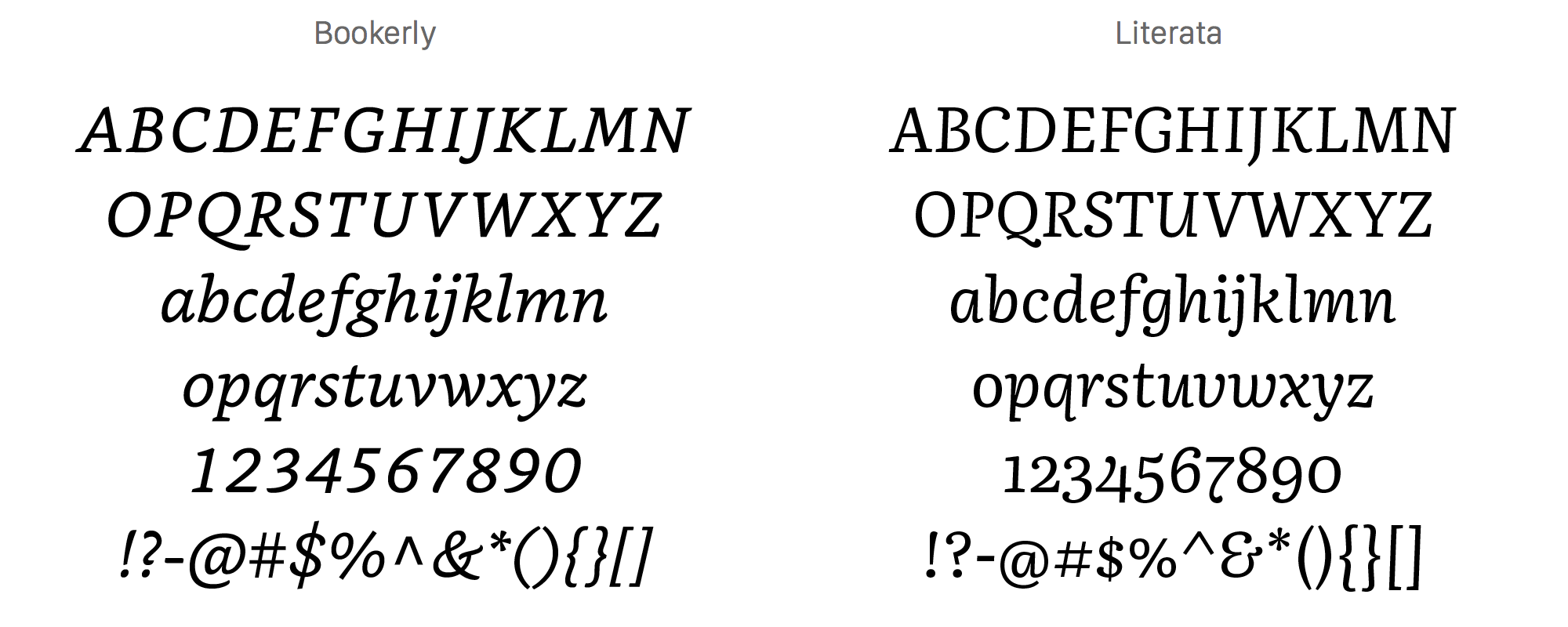

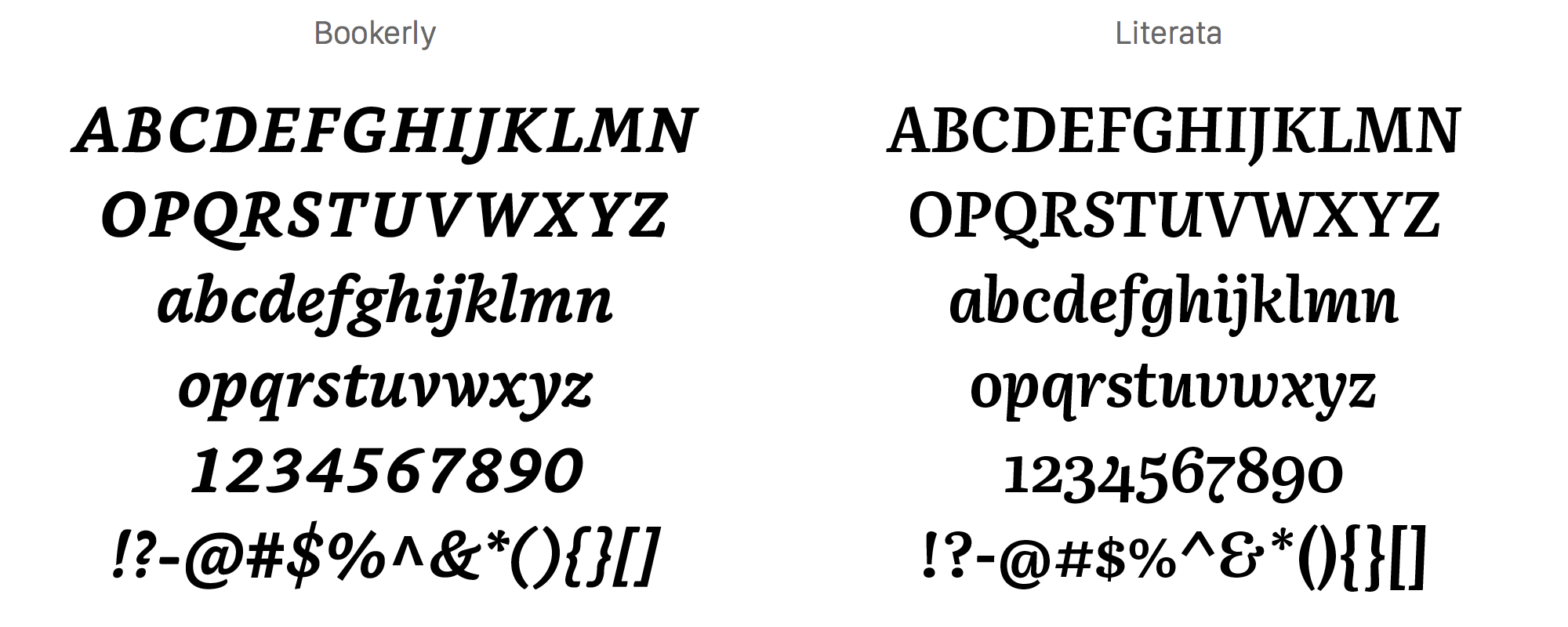

My verdict is: both are pretty good! Personally, I like the slightly straighter approach of Bookerly a little better. But especially the bold weights are equally nice and impressive. Good job by both Amazon and Google!
PS: Could be fun the put Apple’s San Francisco up here as well. Not quite the same application, but I’m happy to see many of the large corporations put their weight behind better typography.
Responses
I just read your blog about Amazon Bookerly vs Google Literata: Fight!
Wow nice fonts indeed!
Just curious where I can find those font? Can you send me the file/link to download both fonts? I hope so :D
Thanks
As far as I know both fonts are proprietary to their respective platforms, but if you look around on Google for a bit, they’re pretty easy to find.
Thanks very much for this. Excellent review and comparison.