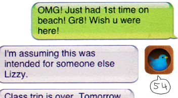
 Fixing the missing SMS character count with iPhone OS 3.0
 This morning my girlfriend Eva surprised me with an incredibly smart solution to a shortcoming in iPhone’s SMS app that had been bugging me ever since it first launched in 2007. As you all know, the iPhone does not show a character count for messages as you type. Or ever, for that matter.
I read about the “after four lines it’s 160 characters” hints and some SMS apps for jailbroken iPhones, but since I’m on a 3GS right now and there is no jailbreak as of today, I find her idea really simple and brilliant.
It is pretty simple and straightforward: since we got copy and paste with iPhone OS 3.0 we can now safely write our messages in apps other than SMS.app. And there are apps out there that DO keep count on message characters. That’s right: twitter apps! For my first try I chose birdhouse (which I bought just this morning for this exact matter but there are plenty of free ones like twitterrific) which has the most beautiful icon I have on my phone right now. It works like this:
1. create a new tweet in your favorite twitter app
2. type until it displays -20 (that’s a minus, since we want 160 characters instead of 140)
3. copy the text
4. switch to SMS.app
5. paste the text and send your exact 160 characters
I know it’s a little bit of a workaround, but a really good one I figured. And it works like a charm. If you don’t need it, just dismiss it, but I only have a 40 SMS/month plan and hate to waste an entire SMS for just a few to many characters. If you like the tip, have a look at Eva’s site (and buy one of her prints!)